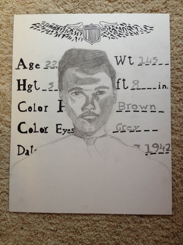
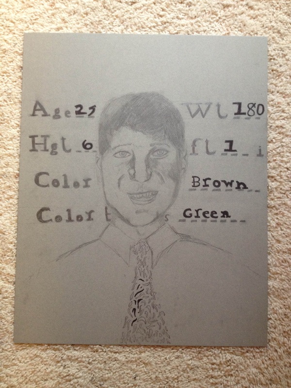

My summer artwork is based on the idea of chance. I think it’s absolutely fascinating how coincidences and close calls go, and how many people they affect over such a long period of time. My father’s father served in World War 11, where he could have very easily been killed, which would have meant that my father would not have been born, and, in turn, neither would I. There are also, obviously, coincidences much smaller than this one that affect more people, and vice versa. It’s amazing how everything connects and somehow manages to either work out or not.
I knew, this summer, for my work, I wanted to do something family oriented. I didn’t want to resort to anything cheesy like a family tree or something along those lines, but I’m happy with what I decided to do instead, even if the finished pieces don’t have fancy, elaborate picture frames like I originally intended (too expensive). Another thing that I originally intended but didn’t work out because of the lack of the picture frames was hanging them up with gold cord or strong golden string. Those two things were, luckily, the only ideas I had to say goodbye to during this process; the rest turned out, I think, fairly well.
Something I did get to incorporate were my doodles—as you can see, a good chunk of each of the portraits is a bunch of squiggly lines. This is a doodle I’ve been doing on the side of all of my papers since probably around the sixth grade. It was super fun to actually include them in my artwork, and I think they turned out looking really cool! Something else that I think turned out really well are the letters in the background--those are actually based on a identification card my grandfather (the one on the left) had when he was in the war. It was hard to get the font right, but I think it looks okay. I wanted to repeat it for all three for the sake of similarity; same with the doodles and the color scheme.
I spent a long time on these three—I don’t know the exact count, but it was probably around fifteen hours. The faces were the most difficult part, as expected, but the shading and lettering also kind-of sucked. As shading and lettering does.
I learned a few things while making this project; one was what my grandfather and father looked like in their mid-twenties (even though I already knew that, once I drew them, I knew it on a whole new level), and the other, more important thing, was spacing, layering and drawing out the all the letters and making sure that my doodles fit in right with the portraits. It’s important to learn spacing, trying to figure out how everything fits and which order everything should go in, and I’m glad I got to play with it in this project.
Based on what I just told you and my experience working on this summer work project, I would give myself a low A or B. They’re not the best things ever or anything; they’re a little messy and there were some things that I couldn’t get accomplished, but I think I managed to work with what was available, and I’m very proud of the result.
 RSS Feed
